Articles & Guides
Clear explanations of the money decisions behind our calculators — how mortgages, loans, taxes, and investing actually work, with real examples.
Business · 5 min read
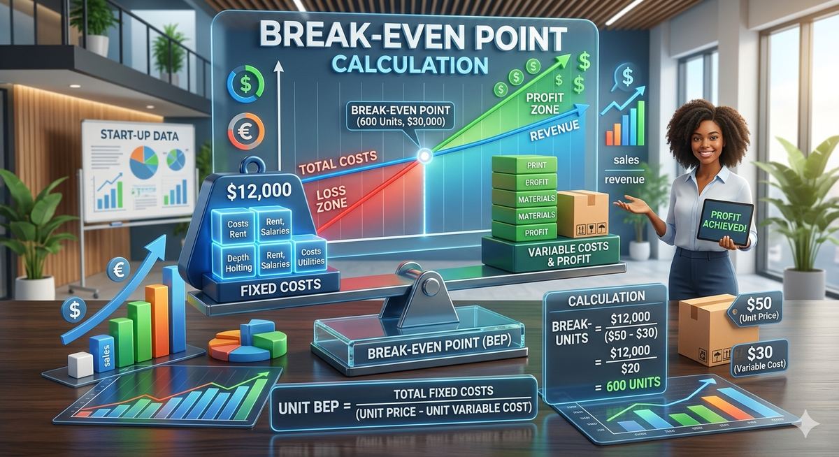
How to Calculate Your Business's Break-Even Point
A practical guide to break-even analysis — what it means, how to calculate it, and why it matters for pricing and planning decisions.
Business · 4 min read
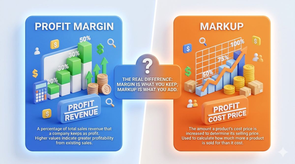
Profit Margin vs Markup: What's the Real Difference?
A clear explanation of the difference between profit margin and markup — two related but distinct pricing concepts that are frequently confused.

General · 4 min read
How to Split a Bill and Calculate Tips Like a Pro
Everything you need to know about tipping norms and splitting a bill fairly among a group, with clear examples.

General · 4 min read
A Simple Guide to Calculating Percentages (No Math Anxiety)
A clear, practical explanation of the three most common percentage calculations you'll actually use in everyday life.

Home & Cost · 5 min read
Is Solar Worth It? A Realistic Cost-Benefit Breakdown
An honest look at the real factors that determine whether solar panels pay off for a given home — payback period, savings, and what affects the math.
Home & Cost · 5 min read
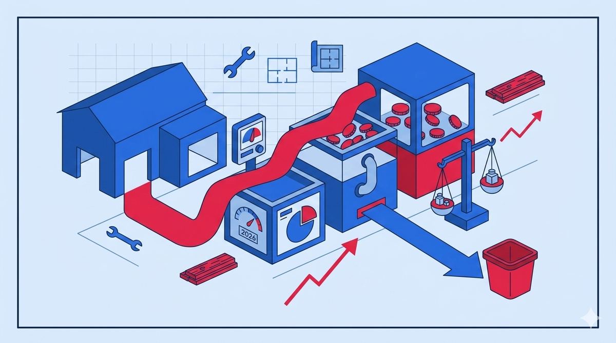
How Much Does a Home Renovation Really Cost in 2026?
A realistic guide to home renovation budgeting — typical cost ranges by project type, and why a contingency buffer is essential.

Tax · 5 min read
Capital Gains Tax Explained: Short-Term vs Long-Term
How capital gains tax works on investments, why holding period matters so much, and a real example showing the tax difference.

Tax · 5 min read
How Tax Brackets Actually Work (You're Not Taxed at One Rate)
Clearing up the most common misunderstanding about federal income tax — why moving into a higher bracket never reduces your take-home pay.
Salary & Paycheck · 5 min read
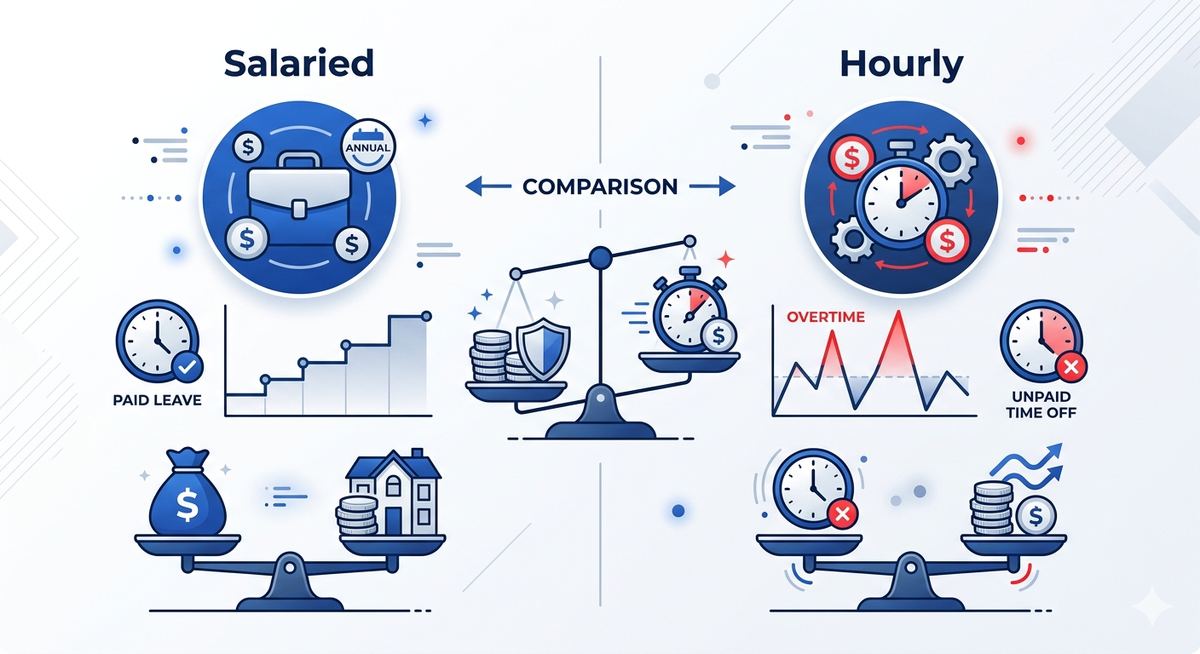
Salaried vs Hourly: How to Compare Job Offers Fairly
How to convert between salaried and hourly compensation to make a genuinely fair comparison between different job offers.
Salary & Paycheck · 5 min read
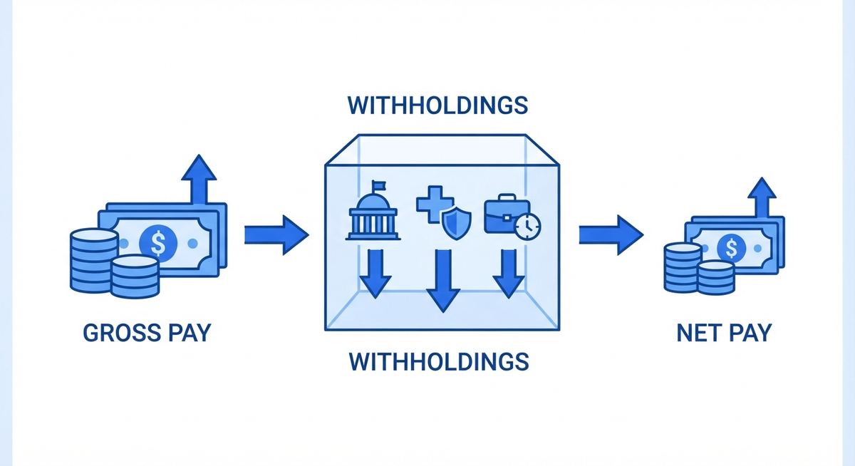
How Your Paycheck Tax Withholding Actually Works
A clear explanation of how federal tax withholding is calculated from your paycheck, why your W-4 matters, and why a big refund isn't necessarily a good thing.

Retirement · 5 min read
401(k) vs IRA: Which Retirement Account Should You Prioritize?
A practical comparison of 401(k) and IRA accounts — contribution limits, employer matches, and a suggested order for prioritizing your retirement savings.

Retirement · 6 min read
The 4% Rule and Early Retirement (FIRE) Explained
What the 4% rule actually says, where it comes from, and how it's used to calculate a target number for financial independence or early retirement.
Investment · 4 min read
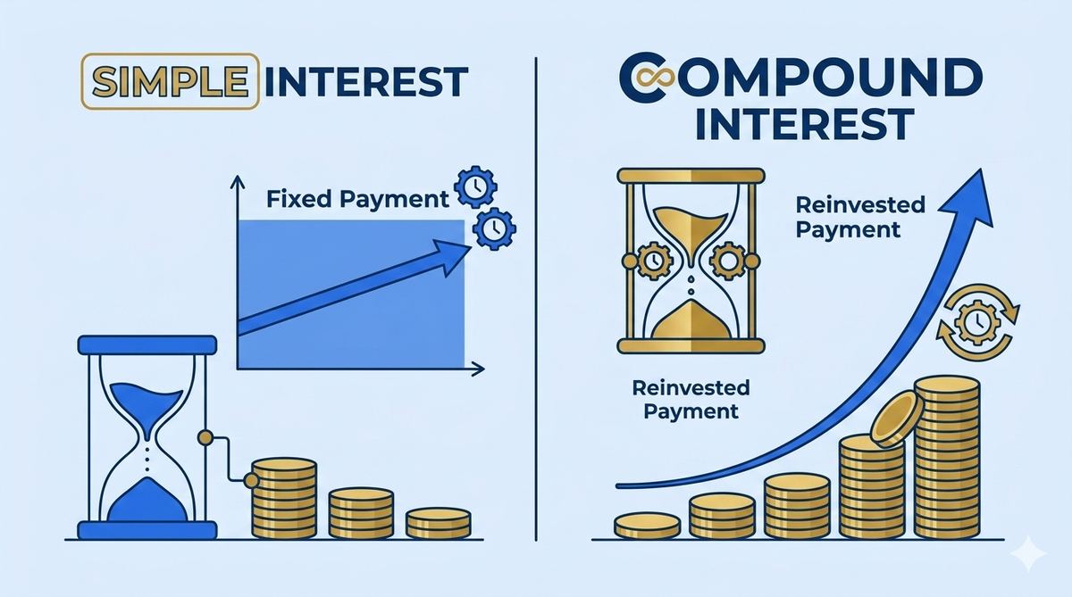
Simple Interest vs Compound Interest: The Real Difference
A direct comparison between simple and compound interest, where each is actually used, and how much the difference matters over time.

Investment · 5 min read
What Is Compound Interest and Why It's Called the 8th Wonder
A clear explanation of how compound interest actually works, why time matters more than almost any other factor, and a real example showing its long-term power.
Debt & Credit · 5 min read
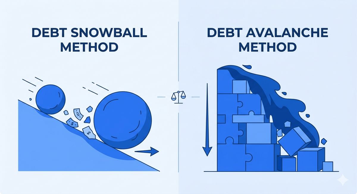
Debt Snowball vs Debt Avalanche: Which Method Wins?
A clear comparison of the two most popular debt payoff strategies — which one saves more money, and which one people actually stick with.

Debt & Credit · 6 min read
How to Pay Off Credit Card Debt Faster (Without a Miracle)
Practical, realistic strategies to pay off credit card debt faster — how minimum payments trap you, and what actually accelerates payoff.

Auto & Car · 5 min read
How to Get the Best Auto Loan Rate in 2026
Practical, actionable steps to qualify for a lower auto loan interest rate, and how much a better rate actually saves over the life of the loan.
Auto & Car · 5 min read
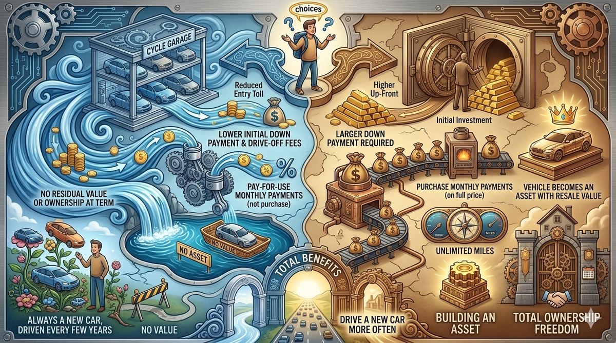
Lease vs Buy: Which Car Option Actually Saves You Money?
A realistic breakdown of leasing versus buying a car — what each option actually costs over time, and the situations where one clearly beats the other.
Mortgage & Real Estate · 6 min read
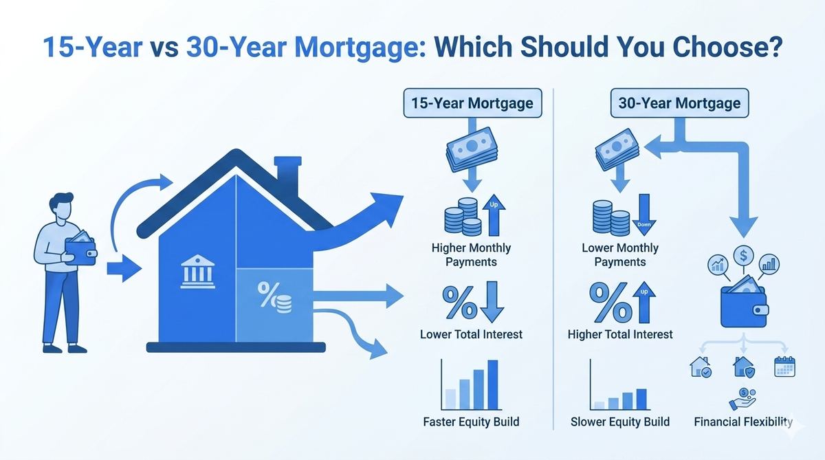
15-Year vs 30-Year Mortgage: Which Should You Choose?
A practical comparison of 15-year and 30-year mortgages — the real tradeoffs in monthly payment, total interest, and financial flexibility, with a worked example.

Mortgage & Real Estate · 6 min read
How Mortgage Payments Work: A Complete Breakdown
A clear, no-jargon explanation of how your monthly mortgage payment is calculated, what PITI actually means, and why early payments feel like they barely touch your balance.